AE DevStudio
Guidelines and Downloads
Branding guidelines from AEDevStudio applies not only to icons and logos. It is a combination of logos, colors, fonts and different graphic elements to create a single complete image.
The following guidelines will help You to achieve the most appropriate use of individuality, show you how to create a custom design and how to understand such designs.
Logo
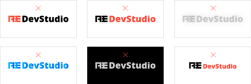
Our logo is "flexible", including the sign of communication and movement. It consists of two basic elements - symbol and logotype, and the additional third element of the slogan. We use the same version in print, on screens and scenery. When it was used, the logo is always simple, without shadows, reflections or any graphical effects.
Lines below include stages and steps to achieve the final production of our logo in the best possible way.


Free space
For the sake of clarity and visibility and maximum visibility, the logo must have sufficient free space around it. In this space there is nothing superfluous - no graphics or any other elements that might cause visual confusion.
When using the full logo (symbol and logotype), or only the symbol or logo should be kept free space 100% of the maximum height of the logo. In special cases, when the 100% free zone is not available or not available, You can use the free space by 50%.

Dimensions
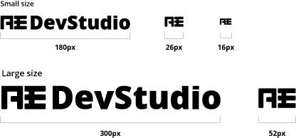
To ensure that our logo was actually used in different conditions, it is designed in different sizes to be suitable for all conditions, no matter where he was used as a logo of small size for mobile applications and a device or a larger logo for printing and any other use.
Colors
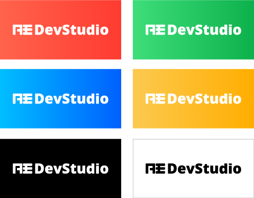
Our logo should be in two colors; black or white. However, you can change the background color for one of the branded colors AEDevStudio, as shown in the following images, or you can use a monochrome version of the logo.
 Please don't do
Color AEDevStudio
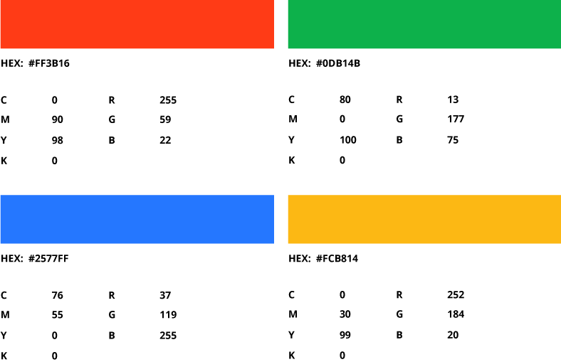
There are four basic colors used in AEDevStudiо: Red, Green, Blue and Yellow. These colors are combined and used in two forms - solid form or gradient form. Here are the code for each color mode:
Solid color
Gradients

Typography
branding AEDevStudio, we use a very nice, simple and easy fonts, both in print and online versions. The font "Open Sans" is used for text in English and Russian language.

Shapes AEDevStudio
AEDevStudio has a round shape logos used in the creation of AEDevStudio graphic elements. It is available in solid colors and grey pattern.
Design patterns
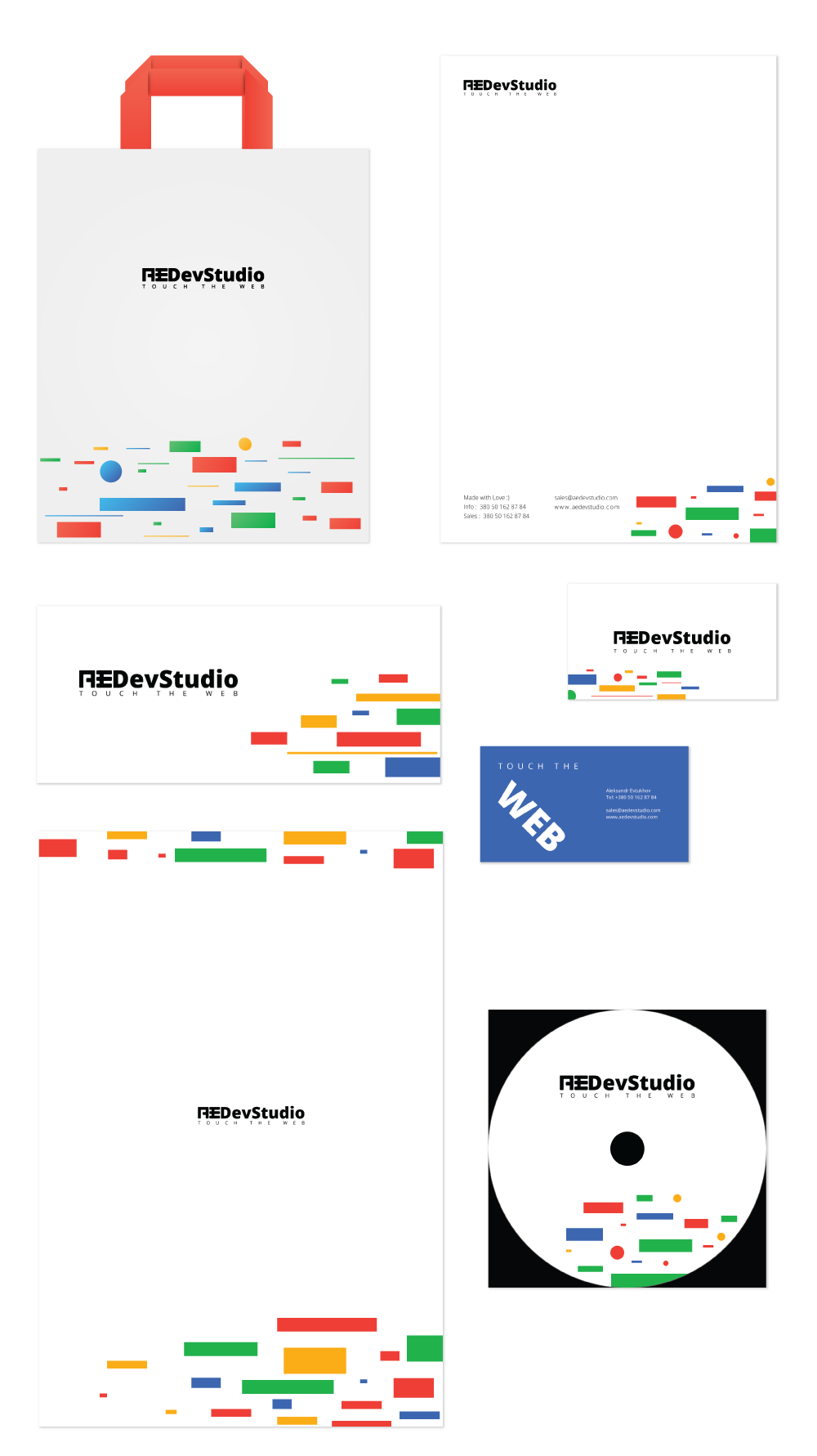
Here are a few samples of the design in which our logo, colors, fonts and graphic elements are used in a variety of ways to create a unique AEDevStudio.
Download
Because we believe in sharing knowledge, that's our logo, ready for multi-purpose use. Now You can use our branding materials for many purposes, such as Logos, Fonts, Colors, Stationary, Advertising, Templates.
Logo
AEDevStudio Logo is a symbol which clearly tells about our business in the first place uniqueness/first features, and then color.
DownloadFonts
Font is very important to achieve high-quality typography and readability, so we use the roboto font.
DownloadColors
We quote: "colors are the smiles of nature." We use a wonderful color mix that is comfortably perceived.
DownloadVisual objects
Here we have gathered all visual objects, maps, pens, CD-ROMs and similar devices, which You can use in accordance with our use policy.
DownloadAdvertising
All advertising needs AEDevStudio like brochures and leaflets can be used in print or books.
DownloadDesigns and Drawings
Patterns AEDevStudio can be used as decoration or in the background, as they are filled with our brand colors.
Download